The 18-team Big Ten Conference is home to some of the biggest and most historic brands in football, basketball or otherwise in college athletics.
Founded in 1896 with original members Wisconsin, Michigan, Purdue, U-Chicago, Illinois, Minnesota and Northwestern, the Big Ten is by far the oldest conference in college athletics. That original group of seven schools expanded to nine in 1899 with the additions of Iowa and Indiana. The number grew to 10 when Ohio State joined in 1912. Once Michigan State replaced Chicago in 1949, the core of the conference was established.

The Big Ten now contains far more schools than its name suggests. The conference expanded to 18 members with the additions of former Pac-12 powers USC, UCLA, Washington and Oregon. That 18-school group is the biggest brand, in size and presence, in college athletics — although the SEC may argue otherwise.
So far this offseason, we’ve re-ranked the Big Ten’s 18 football stadiums, evaluated each based on its in-game atmosphere, plus ranked the conference’s uniform combinations, its classic collection of helmets and its memorable fight songs.
Now, to tie a bow on our offseason ranking series before season preparation begins in earnest, here is an extended look at the Big Ten’s 18 logos, ranked from worst to best.
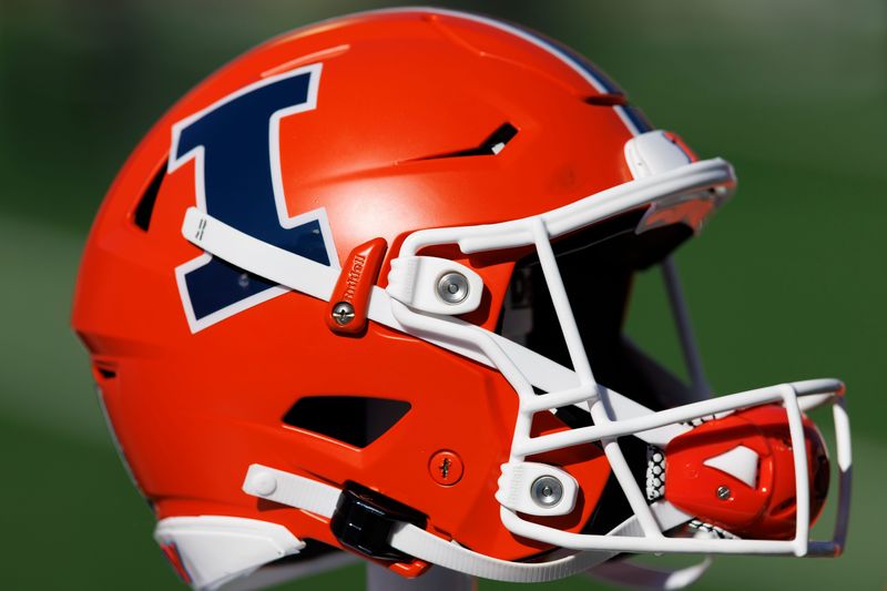
18. Illinois Fighting Illini
It’s hard to do much with a block ‘I.’ The logo is at least distinct, which is a bonus in these rankings. Some of that is due to the contrast between dark blue and the Fighting Illini’s orange base color. There is no such thing as a ‘bad’ logo, though this one falls far below the conference’s best.
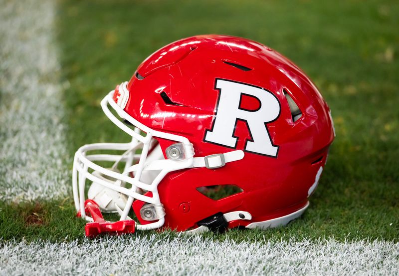
17. Rutgers Scarlet Knights
Rutgers’ block ‘R’ fits into the category with Illinois’ logo. The font of the full ‘Rutgers’ name is unique, although the ‘R’ logo is mostly nondescript.
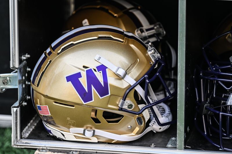
16. Washington Huskies
Washington’s color scheme is among the best in college football. But this isn’t a uniform ranking; it’s a focus on only the logo. Washington’s logo is far from Wisconsin’s ‘Motion W.’
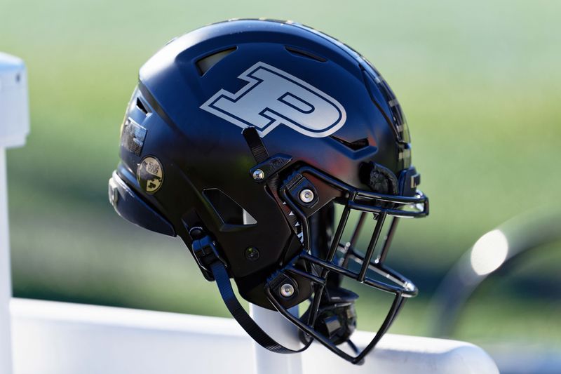
15. Purdue Boilermakers
Purdue’s logo provides a bit more than just a simple ‘P.’ The team’s gold and black color scheme is also a plus, though this ranking only considers the logo itself.
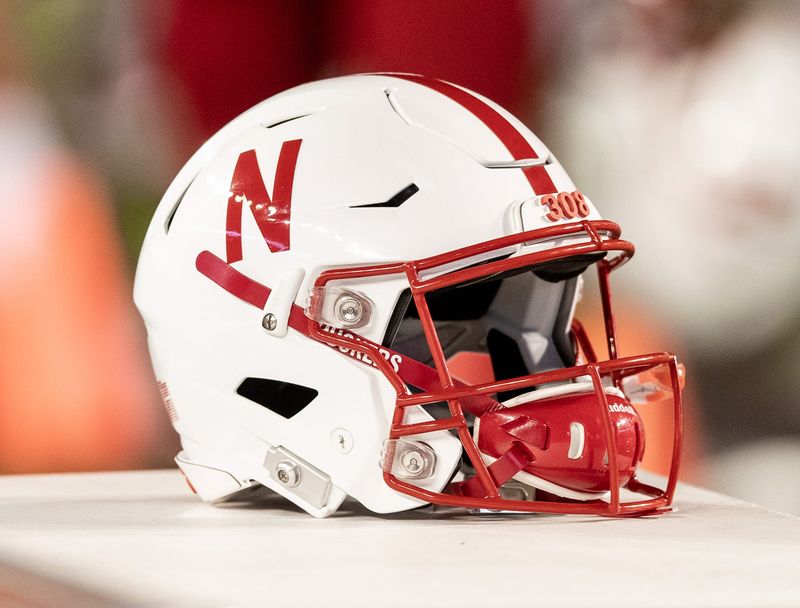
14. Nebraska Cornhuskers
Nebraska’s logo isn’t much different from some of the others on this lower tier. However, it deserves credit for its history. This logo is synonymous with some of college football’s biggest moments in the 1990s.
Get more (Nebraska) news, analysis and opinions on Cornhuskers Wire
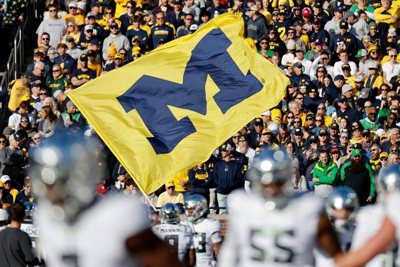
13. Michigan Wolverines
We’ve ranked Michigan’s football uniforms and helmets up there with the best in the Big Ten. The logo itself doesn’t compare, however. Yes, the blue-on-maize or maize-on-blue ‘M’ is a college football classic. But it lacks the top-end design of the conference’s best.
Get more (Michigan) news, analysis and opinions on Wolverines Wire
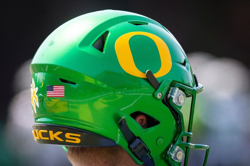
12. Oregon Ducks
Oregon is known for its unique uniforms, flashy helmets and ever-changing on-field look. While some consider the Ducks’ uniforms among the conference’s best, no one should make the same argument for the logo itself. It’s just an ‘O,’ with a somewhat unique shape.
Get more (Oregon) news, analysis and opinions on Ducks Wire
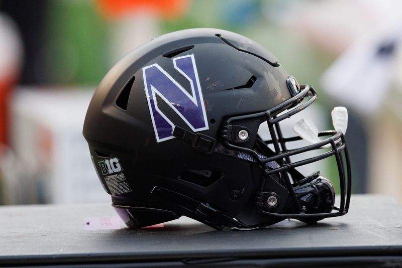
11. Northwestern Wildcats
Northwestern gets points for the unique design of its logo. Its minor design features differentiate it from the block letter logos, which many in the conference have.
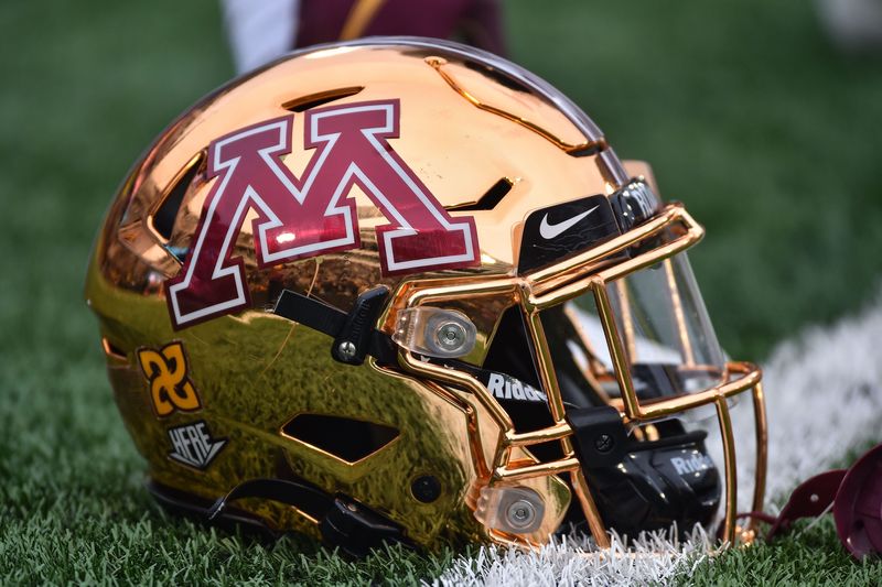
10. Minnesota Golden Gophers
Minnesota’s logo is distinct and does well to fit the theme of the jerseys on which it is included. The logo gives the school and the team clear branding, which is a positive in these rankings.
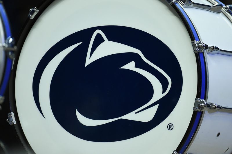
9. Penn State Nittany Lions
Penn State begins the tier of the Big Ten’s elite logos. The logo is unlike any other in college athletics, plus clearly represents Penn State without the letters ‘PSU.’
Get more (Penn State) news, analysis and opinions on Nittany Lions Wire
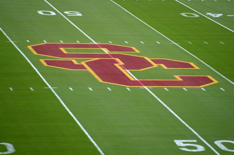
8. USC Trojans
USC’s Trojan logo could also qualify for a spot near the top of these rankings. But our focus is on its primary ‘S-C’ logo, which does a masterful job of combining two letters and establishing the school’s primary colorway.
Get more (USC) news, analysis and opinions on Trojans Wire
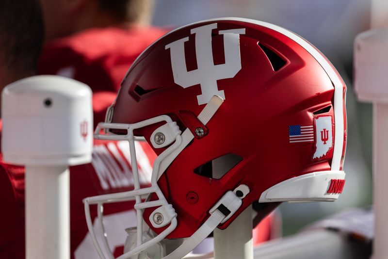
7. Indiana Hoosiers
Indiana’s logo is another strong combination of multiple letters, I-U. The trident shape puts the logo a touch higher than USC’s. This logo also gets points for being effective with just a simple red-on-white or white-on-red color scheme.
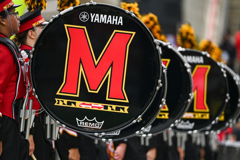
6. Maryland Terrapins
Maryland has one of the most underrated logos in college athletics. The stylized M has a distinct font and color scheme, plus it is underlined by a small snippet of the state flag. This logo has numerous design features without being overly flashy.
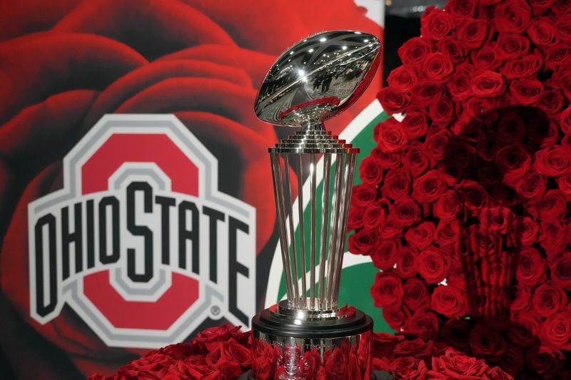
5. Ohio State Buckeyes
Ohio State’s logo ranks favorably for several reasons. First, the squared-off shape of the ‘O’ and surrounding gray trim distinguishes it from other letter-only logos. Next, the full Ohio State name is a surprisingly strong design feature. It’s a great all-around logo.
Get more (Ohio State) news, analysis and opinions on Buckeyes Wire
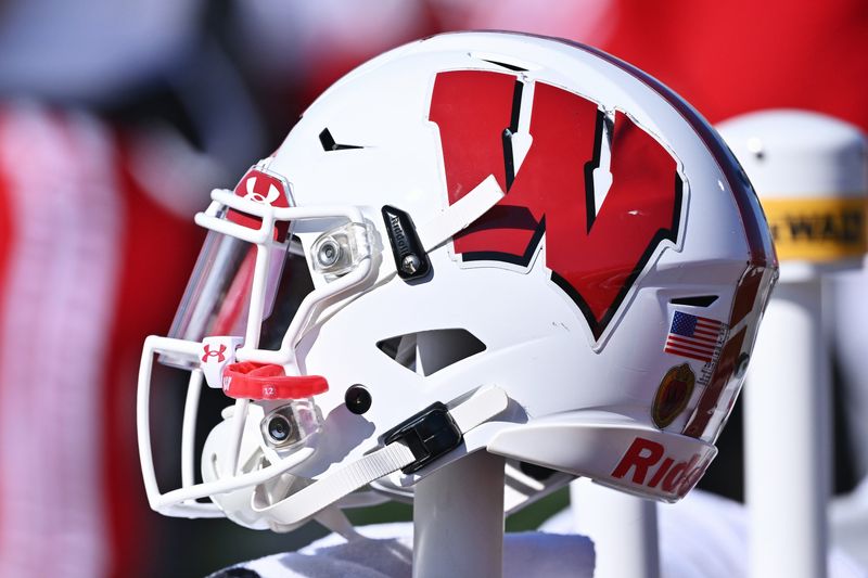
4. Wisconsin Badgers
Wisconsin’s “Motion W” has become a Big Ten classic. Its shadow and shifted form give it more life than a simple block letter. The logo’s prominent placement on each side of the Badgers’ helmets also adds to its presence.
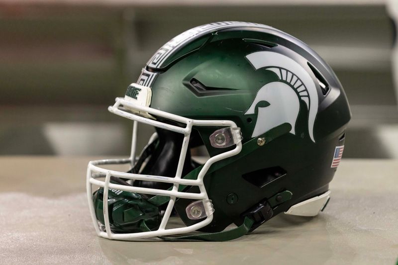
3. Michigan State Spartans
Like Penn State’s Nittany Lion logo, the Michigan State Spartan clearly identifies the team and its brand without needing the school’s name or letters. The Spartan helmet itself is also an extremely cool-looking design.
Get more (Michigan State) news, analysis and opinions on Spartans Wire
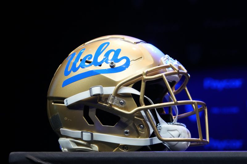
2. UCLA Bruins
UCLA’s cursive script logo and underline are a vintage look. While more than one letter often complicates a logo, UCLA does it in a clean and easy-to-read way. Other schools without a four-letter hyphen would have trouble pulling off a similar look.
Get more (UCLA) news, analysis and opinions on UCLA Wire
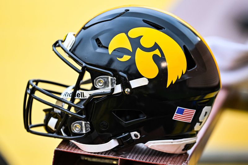
1. Iowa Hawkeyes
The Iowa Hawkeye is the best of any mascot-based logo. As clearly stated, those designs are generally favored over a simple letter, especially if that letter lacks any design or creativity. The Hawkeye is among the more complicated designs in the conference, although it clearly brands the school and its teams while only using the yellow-on-black or black-on-yellow colorway.
Get more (Iowa) news, analysis and opinions on Hawkeyes Wire
Contact/Follow @TheBadgersWire on X (formerly Twitter) and like our page on Facebook to follow ongoing coverage of Wisconsin Badgers news, notes and opinion
This article originally appeared on Badgers Wire: Ranking all 18 Big Ten logos from worst to first
Reporting by Ben Kenney, Badgers Wire / Badgers Wire
USA TODAY Network via Reuters Connect