Helmets. They are seen as the symbol of a college football team. You have throwback lids that hearken to yesteryear, new age ones worn with alternate jerseys, and refurbished ones that try to rebrand a program in need of it. Many teams in the Big Ten have iconic helmets that stand the test of time, while others could use a little more work than just slapping a logo on both sides.
And then there’s Oregon, which has more combinations than your local YMCA locker room.

We decided to poll an array of people from — um, our site here — to rank the best helmets in the Big Ten. Of course, opinions vary, and of course, we might be homers here with an Ohio State slant, but we’ll try to be as objective as possible (hopefully, we don’t make too many of you angry).
Also, we’re going with the traditional helmet here, not any of the alternate stuff. We like all of that, but none of those are symbols of the programs. Here’s a look at ranking the headgear of all 18 football teams in the conference that loves to embrace tradition. We’ll go from worst to first. Don’t shoot the messenger, just get on board with what he’s selling.
No. 18 – Rutgers Scarlet Knights
Why the Ranking
Like most programs, we’ve seen other versions of the helmet. There’s been a classic white and a silver one at times. However, this is the look we’ve gotten used to, and it is about as non-descript as can be. Red with the letter “R.” There’s not much of a winning tradition to hang your hat on in Piscataway, so why not overhaul this lid? Can we at least get a stripe somewhere? Anywhere?
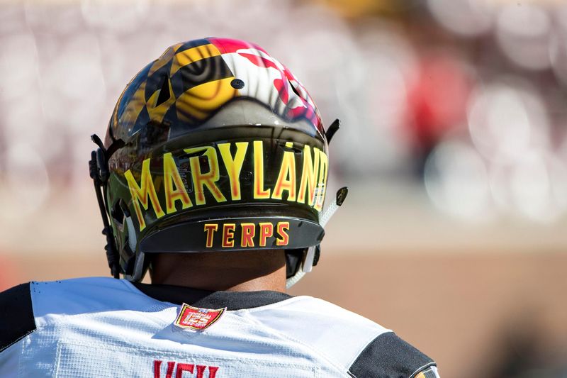
No. 17 – Maryland Terrapins
Why the Ranking
Well, what do we have here? Your guess is as good as mine. It’s like the shows “Inkmaster” and “Design Star” had a renegade child that threw graffiti on a lid. Sometimes you can outthink yourself, and I fear that’s exactly what happened here. I know what the decision-makers on these sorts of things are going for here, but it has just never worked, not even with time.
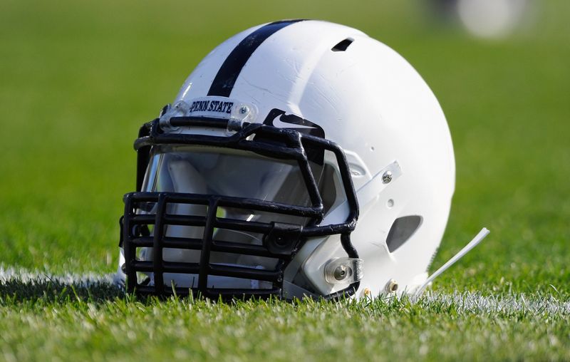
No. 16 – Penn State Nittany Lions
Why the Ranking
I know I’m going to get nastygrams from the purists out there, but c’mon. If I hear that plain blue and white helmets with one stripe down the middle are iconic one more time, I’ll give you my black and white television set to replace your Ultra High-Definition Smart TV with surround sound. No? That’s what I thought. Penn State fans are the only ones embracing nothing on a palate of nothing.
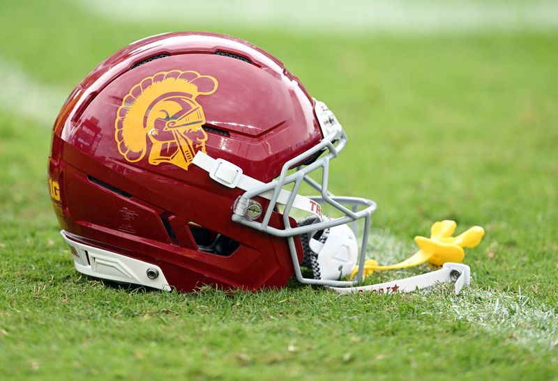
No. 15 – USC Trojans
Why the Ranking
The 1970s screen press is calling to get its helmet design back. On the surface, the USC helmet is pretty bland, but it does shout tradition from one of the iconic brands in the college game. It’s as if the Michigan State Spartan head and Minnesota colors got together in the multiverse and accidentally exchanged DNA. This helmet could use a r
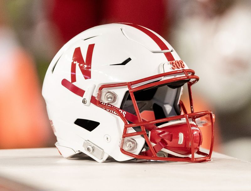
No. 14 – Nebraska Cornhuskers
Why the Ranking
Hey, I have an idea. Let’s make a red “N,” but make it look like three pieces of tape stuck together. Better yet, let’s thumb wrestle with Netflix to see who gets to keep the middle letter of the alphabet as the face of the brand. While we’re at it, we won’t add anything else to it. Not an outline, and certainly not a logo. Also, let’s keep the lettering as slim as possible, slap it on the side of a helmet, and top it off with the obligatory stripe down the middle that’s exactly the same width as the lettering. Pure gold, Nebraska. Don’t ever change.
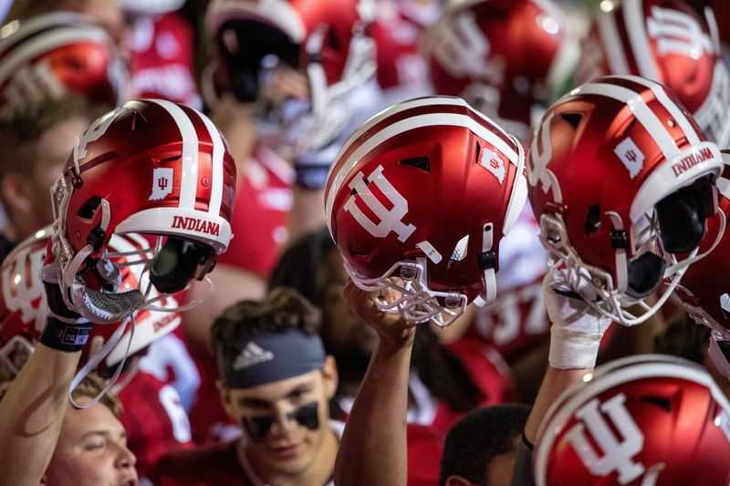
No. 13 – Indiana Hoosiers
Why the Ranking
Somewhere along the line, the folks at Indiana decided to think outside the box and put two stripes down the middle of the helmet for a drastic change. That’s about as Indiana as you can get, I guess. At least someone tried to put an I and a U together in a crazy, pitchforky kind of way for the logo that looks an awful lot like a candelebra. So, there’s at least that to work with. The Hoosiers have started winning on the field, but are still taking a big loss in helmet design.
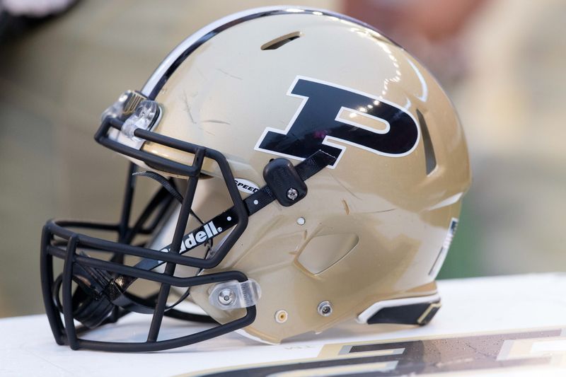
No. 12 – Purdue Boilermakers
Why the Ranking
I know Purdue likes to bust out the helmets with the railroad tracks down the middle, but that’s not what we’re judging here. Instead, it’s the traditional one. Stripes down the middle? Check. Letter on the side with a slight slant and outline. Check. Different color face mask from the helmet body? Check. This helmet checks all the boxes of how to make a boring helmet design, and that’s about it. At least the Boilers didn’t screw anything up with it, so we’ll count that in the win column, which is one more win than Boiler Up had in the Big Ten last year.
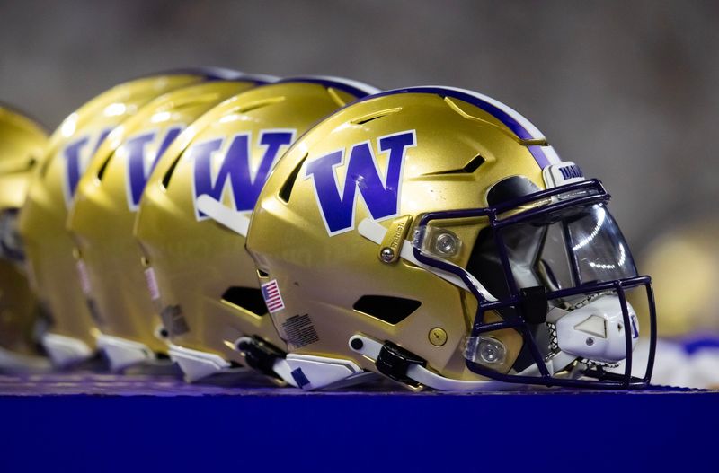
No. 11 – Washington Huskies
Why the Ranking
We’re not sure if the same team of design stars left Purdue and moved to the Pacific Northwest for a better life, but the Washington helmet looks eerily similar to the Purdue one. The template is the same, there’s just a “W” in place of the “P,” and purple in lieu of black on a gold base that’s a splash brighter. This is a dead heat, but we’ll give the nod to purple for a better look to break the deadlock between these two.
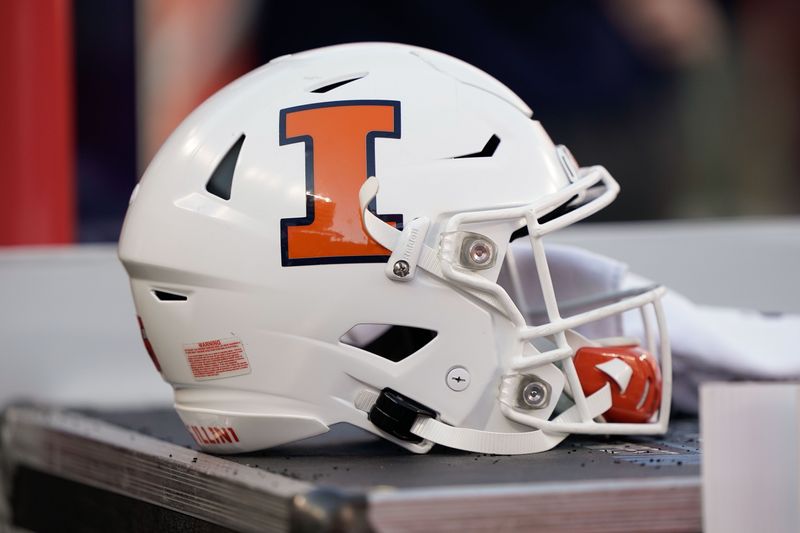
No. 10 – Illinois Fighting Illini
Why the Ranking
I have to admit, it’s hard to find the standard-issue helmet for Illinois any longer. The Illini have been alternating between white, orange, and a matted blue base over the last few years. The all-white one, though, is the one that seems to have replaced the one that got creative by stamping the word — stay with me here — “Illinois” on the side of the helmet. It’s a clean look, but it doesn’t have any pop, much like the Illini’s College Football Playoff chances.
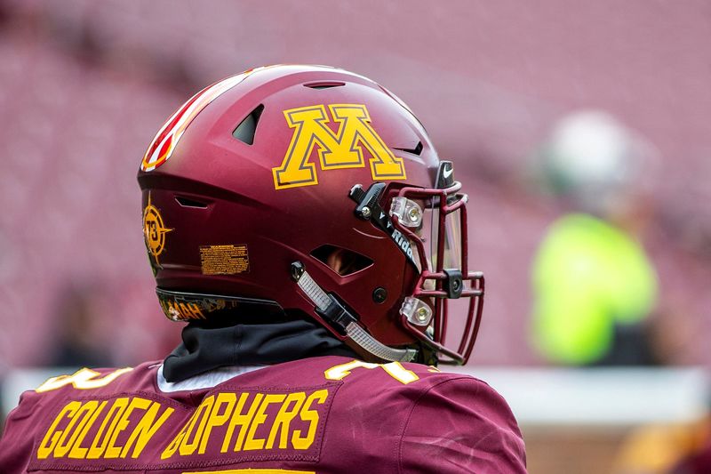
No. 9 – Minnesota Golden Gophers
Why the Ranking
The gold helmet Minnesota breaks out from time to time actually looks pretty sharp and futuristic, but that’s more of an alternate lid. This is the one we’re accustomed to seeing, and it’s awfully hard to pull off some of the ugliest colors in college football. It works, though, and it’s a good job of doing something with little to work with. Sounds a lot like the Gophers’ recruiting classes over the years.
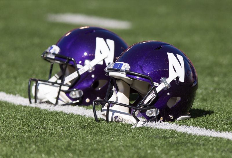
No. 8 – Northwestern Wildcats
Why the Ranking
To be honest, Northwestern doesn’t use this helmet as much as it used to, but the solid purple top is what the Wildcats are known for. And we’re really still in boring territory here, but you have to give credit to men full of testosterone being able to rock out purple on the football field. Also, creative points go to whoever decided to carve out as little space as possible in a white block to make it look like an “N.” Thinking outside the box is what students at such a prestigious university as Northwestern do, after all.
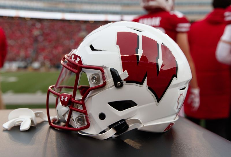
No. 7 – Wisconsin Badgers
Why the Ranking
Wisconsin used to have a plain W on the side of the helmet, much like what we see with Nebraska. The program went through a facelift under former head coach Barry Alvarez and did an outstanding job with the curved lettering and shadow outline. Great job with the proportions, too. It’s not a great helmet, but it has become a good one that lets you know you are watching college football in the Midwest with brats, cheese, and beer within arm’s reach.
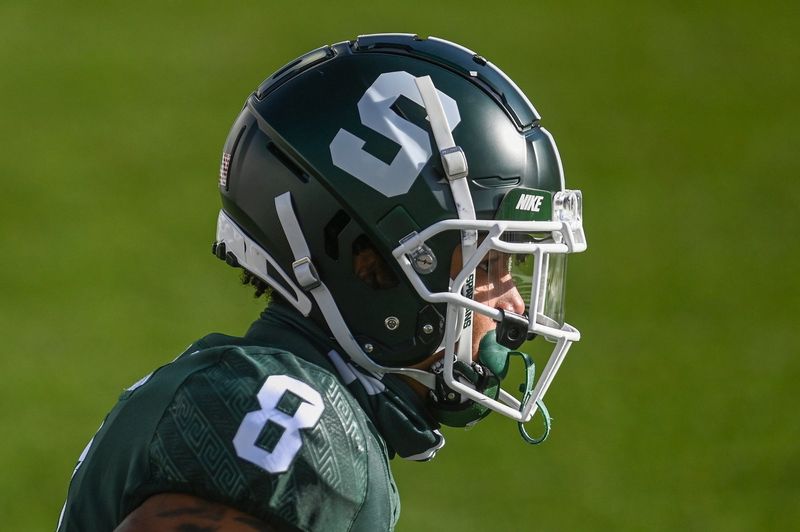
No. 6 – Michigan State Spartans
Why the Ranking
I actually like what Michigan State has done to its helmet design. Now, if the Spartan program will quit changing it, maybe it’ll be on to something. This is clean, but it has a new age look to it. It’s much better than the helmet-on-helmet design of a few years ago. Keep rolling with this Sparty, but try to do more on the football field than just look good coming out of the tunnel.
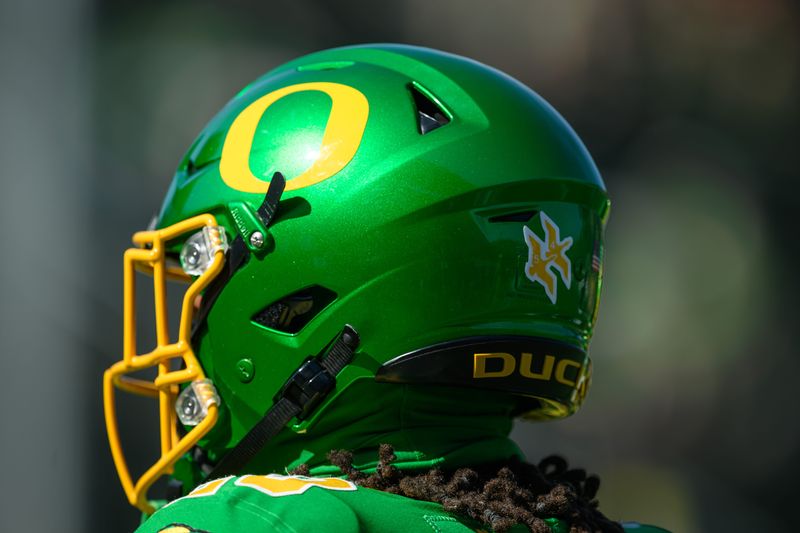
No. 5 – Oregon Ducks
Why the Ranking
It’s hard to know where to rank the Oregon helmet because there are so many versions of it. However, some of the looks are about as edgy and trend-setting as you can find, so we’ll give the school that Nike loves to square dance with credit for being original and creative. At some point, however, creativity is a lot like the food in a middle school cafeteria. Some combinations just shouldn’t go together, no matter how good it looks on the menu in your head.
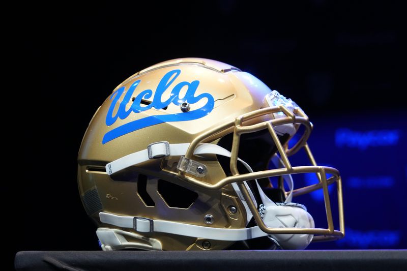
No. 4 – UCLA Bruins
Why the Ranking
Who said that cursive was going out of style? Sometimes, simple wins the day. There’s not a lot of creativity with UCLA’s helmet design, but the baby blue looks great on the golden helmet. The devil might wear Prada, but Bruins rock the baby blue in a rough and tumble sport, and that takes a lot of swagger and guts.
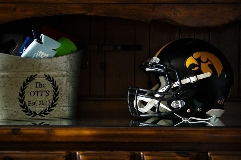
No. 3 – Iowa Hawkeyes
Why the Ranking
What do we have here? Someone took a Pittsburgh Steelers helmet, ripped the logo off the side, and slapped a rather freakishly looking evil birds head on the side in its place. You might think a hawk on the side of a helmet looks “corny” (even for Iowa), but we beg to differ. The black and gold, together with the logo, look great still to this day, even if the Hawkeye head is the only original part of the entire uniform.
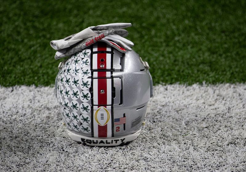
No. 2 – Ohio State Buckeyes
Why the Ranking
It seems like people either love or hate the Ohio State helmet. And, I have to admit, the early-season look is not as iconic as the late-season one that has Buckeye leaves plastered all over that silver sparkle. The colors, helmet stickers, and design look great in prime time, and that’s what it’s all about. Now, before you think we’re biased because we’re an OSU homer site … next please.
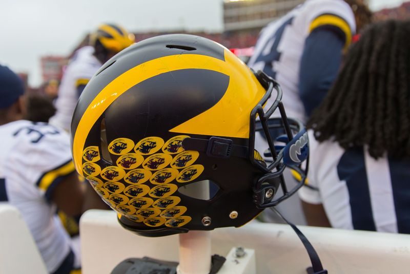
No. 1 – Michigan Wolverines
Why the Ranking
I know we are an Ohio State site, but you have to give credit where credit is due. There is no better helmet in college football. Michigan wasn’t the first program to use winged helmets, but it made the design its own, and it’s an icon and symbol of the sport. The fact that it looks good on a maize and blue palette sets it off even more. Yes, it’s OSU’s biggest rival and one that is rather heated at that — and yes, I think I threw up in my mouth just a little making this happen, but we pride ourselves on taking our medicine here, no matter how bad it tastes.
Contact/Follow us @BuckeyesWire on X (formerly Twitter) and like our page on Facebook to follow ongoing coverage of Ohio State news, notes, and opinion. Follow Phil Harrison on X.
This article originally appeared on Buckeyes Wire: Power ranking all 18 Big Ten football helmets from worst to first
Reporting by Phil Harrison, Buckeyes Wire / Buckeyes Wire
USA TODAY Network via Reuters Connect